Introduction
Here's a bug almost every Filament plugin author hits once. You write a Blade view with some Tailwind classes, like rounded-xl bg-amber-50 p-4. It looks perfect in your playground app. Someone installs your plugin, and it renders completely unstyled.
Also Read: Claude Code & Cursor on Filament: AI Agent Rules That Work
Nothing is broken. It's just how Tailwind works. In this part of the series we'll explain why it happens and the three ways to deal with it, then cover the rest of the presentation layer for Filament Announcements:
- Registering CSS and JavaScript with Filament's asset manager
- Loading a stylesheet only on pages that need it
- Dark mode without writing any dark-mode CSS
- Translations users can override
- A custom schema component that works in any Filament form, not just ours
If you're just joining, Part 3 built the plugin's resource, widget and render hook.
Why Tailwind Classes in Your Plugin Don't Show Up
Filament v4 and v5 use Tailwind CSS v4. A Tailwind build only includes the utility classes it finds when it scans your source files. That keeps the CSS small, but it means:
- Filament's default stylesheet only contains the classes Filament's own views use.
- A user's custom theme only contains classes found in the paths their
theme.csstells Tailwind to scan, which by default areapp/Filamentandresources/views/filament.
Your package lives in vendor/, so by default neither build scans it. Any Tailwind class that Filament doesn't happen to use somewhere else won't exist in the final CSS. Filament's asset documentation addresses this directly, and it gives you three options.
Option 1: Build your UI from Filament's Blade components (recommended)
Filament ships Blade components for most of what a plugin needs: sections, callouts, badges, buttons, icon buttons, modals, dropdowns, tabs and more. They're already styled in every panel, they follow the user's colors and theme, and they support dark mode.
Our banner is built entirely from them:
{{-- resources/views/banner.blade.php --}}
<x-filament::callout
    :color="$announcement->color->getColor()"
    :icon="$announcement->color->getIcon()"
    :heading="$announcement->title"
    :description="$announcement->body"
>
    @if ($announcement->is_dismissible)
        <x-slot name=controls>
            <x-filament::icon-button
                color="gray"
                icon="heroicon-m-x-mark"
                :label="__('filament-announcements::announcements.actions.dismiss')"
                x-on:click="dismiss()"
            />
        </x-slot>
    @endif
</x-filament::callout>
The callout component takes a color (any of the panel's color names, like info, warning or danger), an icon, a heading, a description and a controls slot. We map our enum straight onto it, and the result is indistinguishable from Filament's own UI, in light and dark mode.
Also Read: Auto-Post to LinkedIn PHP from Laravel (2026 Guide)
Option 2: Ship a small precompiled stylesheet
For the few things Filament's components don't cover (in our case, the spacing between banners and above the stack), ship your own CSS file and register it with Filament's asset manager. Keep it tiny, and write plain CSS rather than Tailwind utilities, so it doesn't depend on anyone's build:
/* resources/css/index.css (copied to resources/dist/filament-announcements.css) */
.fi-announcements {
    display: grid;
    gap: calc(var(--spacing, 0.25rem) * 3);
    padding-top: calc(var(--spacing, 0.25rem) * 8);
}
var(--spacing) is Tailwind v4's spacing unit, which Filament's CSS defines. Using it keeps our spacing in step with the panel's, and the fallback keeps it working if the variable is ever missing. The padding-top fixes the flush-against-the-top-bar problem we spotted in Part 3.
Option 3: Ask users to scan your views with @source
If your views really need arbitrary Tailwind utilities, you can ask users to add your package to their custom theme:
/* resources/css/filament/admin/theme.css */
@source '../../../../vendor/thewebtier/filament-announcements/resources/**/*.blade.php';
The skeleton's generated README includes this line for you. It works, but it has a cost: users without a custom theme must create one before your plugin looks right, and that's one more install step where people give up. Use it when you genuinely need it, not by default. See Tailwind's docs on explicitly registering sources for more.
| Approach | Users need a custom theme? | Matches the panel's theme | Best for |
|---|---|---|---|
| Filament Blade components | No | Automatically | Most plugin UI |
| Precompiled plain CSS | No | If you use CSS variables | Layout glue, small custom pieces |
@source in the user's theme | Yes | Yes | Rich custom UI that needs many utilities |
Registering Assets with FilamentAsset
Filament's FilamentAsset facade registers CSS, JavaScript and Alpine components. When the user runs php artisan filament:assets, Filament copies them into public/, in a folder named after your package so file names never clash with other plugins.
We register our stylesheet in the service provider's packageBooted() method:
use Filament\Support\Assets\Css;
use Filament\Support\Facades\FilamentAsset;

public function packageBooted(): void
{
    FilamentAsset::register([
        Css::make('filament-announcements', __DIR__ . '/../resources/dist/filament-announcements.css')
            ->loadedOnRequest(),
    ], package: 'thewebtier/filament-announcements');
}
After filament:assets, the file ends up at public/css/thewebtier/filament-announcements/filament-announcements.css.
Also Read: Create a LinkedIn Developer App for Laravel (2026)
Load CSS only when it's needed
By default, a registered stylesheet is added to the <head> of every Filament page. ->loadedOnRequest() switches that off. You then load it on demand with the x-load-css Alpine directive, which Filament bundles:
<div
  x-data
  x-load-css="[@js(\Filament\Support\Facades\FilamentAsset::getStyleHref('filament-announcements', package: 'thewebtier/filament-announcements'))]"

>
  {{-- banners --}}
</div>
Now the stylesheet only loads on pages that actually render a banner.
Where to register: provider or plugin?
This catches people out, so it's worth spelling out:
packageBooted()in the service provider registers assets globally. Anything that isn'tloadedOnRequest()loads in every panel, even panels that never registered your plugin.$panel->assets([...])in your Plugin'sregister()method registers assets for that panel only. Use this for CSS or JS that has to be present on every page of the panels that use your plugin.
public function register(Panel $panel): void
{
    $panel->assets([
        Css::make('filament-announcements', __DIR__ . '/../resources/dist/filament-announcements.css'),
    ], package: 'thewebtier/filament-announcements');
}
JavaScript and Alpine components
JavaScript works the same way with Js::make(). For interactive widgets, register an async Alpine component with AlpineComponent::make() and load it with x-load and x-load-src, so the script is only fetched when the component appears on screen. The skeleton's bin/build.js compiles resources/js/index.js with esbuild. Run npm run build (or npm run dev to watch).
Our dismiss button didn't need any of that. A few lines of inline Alpine are enough:
<div
    x-data="{
        key: 'fi-announcement-dismissed-{{ $announcement->id }}-{{ $announcement->updated_at?->timestamp }}',
        dismissed: false,
        init() {
            try { this.dismissed = localStorage.getItem(this.key) === '1' } catch (e) {}
        },
        dismiss() {
            this.dismissed = true
            try { localStorage.setItem(this.key, '1') } catch (e) {}
        },
    }"
    x-show="! dismissed"
    x-transition.opacity
>
Two details worth copying:
- The storage key includes
updated_at. If an admin edits an announcement, everyone sees it again, even if they dismissed the old version. localStoragecalls are wrapped intry/catch. Some privacy modes throw when storage is accessed. A banner that can't be dismissed is annoying, but a JavaScript error that breaks the page is worse.
Remind users to publish assets
Filament's installer adds @php artisan filament:upgrade to the app's post-autoload-dump Composer script, and that command runs filament:assets. So most users get your assets automatically after composer require and composer update. Still, put php artisan filament:assets in your README's install steps, because not every app has that script.
Dark Mode for Free
Open the plugin in dark mode and everything already adapts:
Also Read: Laravel: Get a LinkedIn
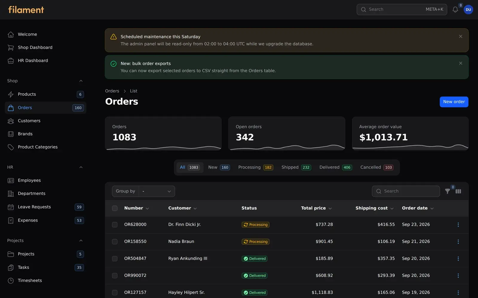
That's the payoff of Option 1. Filament's components carry their own dark-mode styles, and our stylesheet only handles layout, which doesn't change between modes.
If you do write color-related CSS, Filament switches themes by adding a dark class to the <html> element, so scope your rules with .dark .your-class. Better still, use Filament's color CSS variables so your colors follow the user's palette.
Dark-mode support is also one of the badges on your plugin's page in the directory. When you submit your plugin in Part 6, you'll declare whether it's dark-mode ready, so test it both ways.
Also Read: Renew LinkedIn Access Tokens PHP in Laravel (60-Day Fix)
Translations
Calling ->hasTranslations() in configurePackage() registers resources/lang under your package's namespace. Every user-facing string in the plugin goes through the translator:
// resources/lang/en/announcements.php
return [
    'model_label' => 'announcement',
    'plural_model_label' => 'announcements',

    'fields' => [
        'title' => 'Title',
        'body' => 'Message',
        'color' => 'Style',
        // ...
    ],

    'actions' => [
        'dismiss' => 'Dismiss announcement',
    ],
];
TextInput::make('title')
    ->label(__('filament-announcements::announcements.fields.title'))
Users can override any string by publishing the files:
php artisan vendor:publish --tag="filament-announcements-translations"
The files land in lang/vendor/filament-announcements/{locale}/announcements.php. The directory also shows a multilingual badge, and translation pull requests are some of the easiest contributions you'll get once the plugin is public, so it's worth doing from day one.
A few habits that make translators' lives easier:
- Translate enum labels too. Our
AnnouncementColor::getLabel()calls__(), so badges and filters are translated. - Don't build sentences from fragments. Use whole sentences with
:placeholdersso word order can change between languages. - Also make views publishable.
hasViews()gives users afilament-announcements-viewstag, so they can override the banner markup without forking the package.
Building a Reusable Custom Schema Component
So far, everything we've built lives inside our own resource. But plugins get more useful when parts of them can be used elsewhere. That's the "standalone plugin" idea from Part 1.
The create form has a live preview of the banner. Rather than hardcoding it in the form, we made it a proper schema component that anyone can drop into their own forms:
namespace TheWebTier\FilamentAnnouncements\Components;

use Closure;
use Filament\Schemas\Components\Component;
use Filament\Schemas\Components\Concerns\HasDescription;
use Filament\Schemas\Components\Concerns\HasHeading;
use Filament\Schemas\Components\Utilities\Get;
use TheWebTier\FilamentAnnouncements\Enums\AnnouncementColor;

class AnnouncementPreview extends Component
{
    use HasDescription;
    use HasHeading;

    protected string $view = 'filament-announcements::components.announcement-preview';

    protected AnnouncementColor | string | Closure | null $style = null;

    final public function __construct()
    {
        // By default, read the sibling "title", "body" and "color" fields.
        $this->heading(fn (Get $get): ?string => $get('title'));
        $this->description(fn (Get $get): ?string => $get('body'));
        $this->style(fn (Get $get): AnnouncementColor | string | null => $get('color'));
    }

    public static function make(): static
    {
        $static = app(static::class);
        $static->configure();

        return $static;
    }

    public function style(AnnouncementColor | string | Closure | null $style): static
    {
        $this->style = $style;

        return $this;
    }

    public function getStyle(): AnnouncementColor
    {
        $style = $this->evaluate($this->style);

        if ($style instanceof AnnouncementColor) {
            return $style;
        }

        return AnnouncementColor::tryFrom((string) $style) ?? AnnouncementColor::Info;
    }
}
And its view reuses the same callout:
@php
    $style = $getStyle();
    $heading = $getHeading();
@endphp

<div {{ $attributes->merge($getExtraAttributes(), escape: false) }}>
    <x-filament::callout
        :color="$style->getColor()"
        :icon="$style->getIcon()"
        :heading="filled($heading) ? $heading : __('filament-announcements::announcements.preview.placeholder')"
        :description="$getDescription()"
    />
</div>
A few things make this work:
- Reuse Filament's concerns.
HasHeadingandHasDescriptiongive usheading(),description()and their getters, and they accept closures, just like Filament's own components. $this->evaluate()runs closures with Filament's utility injection, which is howfn (Get $get) => ...receives the form's state.- Sensible defaults, overridable. By default the component reads
title,bodyandcolor, but someone with different field names can pass->heading(fn (Get $get) => $get('subject')). - The fields it reads are
live(). Filament's custom component docs point out that a view only refreshes on the next request, so the inputs use->live(debounce: 500)to update the preview as you type.
In your own app, php artisan make:filament-schema-component generates this class-plus-view pair for you. Custom form fields, table columns and infolist entries follow the same shape, extending Field, Column or Entry instead.
Key Takeaways
- Tailwind v4 only compiles classes it can see, and it doesn't scan
vendor/by default. Build plugin UI from Filament's Blade components wherever you can. - For anything else, ship a small plain-CSS file registered with
FilamentAsset, and useloadedOnRequest()withx-load-cssso it only loads where it's used. - Global registration in
packageBooted()loads assets in every panel. Use$panel->assets()in your plugin'sregister()for panel-specific assets. - Using Filament's components gives you dark mode support without writing any dark-mode CSS.
- Put every string through
__(), including enum labels, and make translations and views publishable. - Custom schema components that reuse Filament's concerns and
evaluate()feel native, and users can drop them into any form.
In Part 5, we'll write a proper test suite with Pest and Orchestra Testbench, including a provider-ordering bug that breaks every Livewire test, and set up PHPStan and CI.
Also Read: How to Create a WordPress Plugin from Scratch (2026 Guide)
FAQ
Why aren't my Tailwind classes working in my Filament plugin?
Tailwind v4 only generates classes it finds in the files it scans, and neither Filament's default CSS nor a user's custom theme scans vendor/ by default. Use Filament's Blade components, ship a small precompiled stylesheet, or ask users to add your views to their theme with @source.
Where should a Filament plugin register its CSS?
Register it with FilamentAsset::register() in the service provider's packageBooted() method, passing your Composer package name. Add ->loadedOnRequest() if it's only needed on some pages. For assets every page of your panels needs, use $panel->assets() in the plugin's register() method.
How do users get my plugin's assets into public/?
php artisan filament:assets copies every registered asset into public/. Filament's installer also adds filament:upgrade, which runs it, to the app's post-autoload-dump script.
How do I support dark mode in a Filament plugin?
Use Filament's Blade components, which handle dark mode themselves. For custom CSS, Filament adds a dark class to the <html> element, so you can scope rules with .dark.